This time Google Maps is changing up the route selection screen.
What you need to know
- Google Maps is apparently testing out a new look when selecting a route.
- The updated UI moves the transportation mode selection to the bottom.
- It appears to be testing with a small group, so a wider rollout is unknown.
Google Maps is continuing to add new features and updates to its UI. Just recently, Google brought its split-screen UI from the web client to the Android app, making it easier for users to navigate the virtual streets without getting lost. You can check out our guide to show you how to enable split-screen view in Google Maps on Android. The latest UI change comes to the route selection screen and signals a more uniform look for the app.
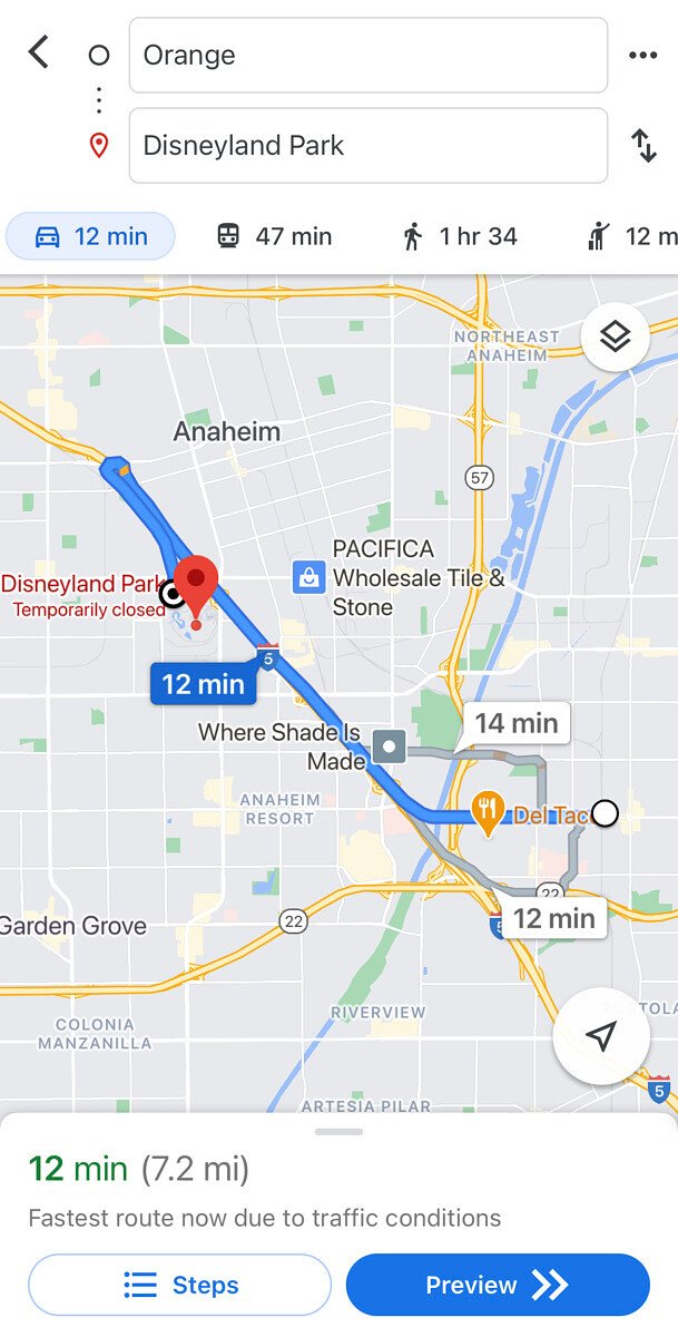
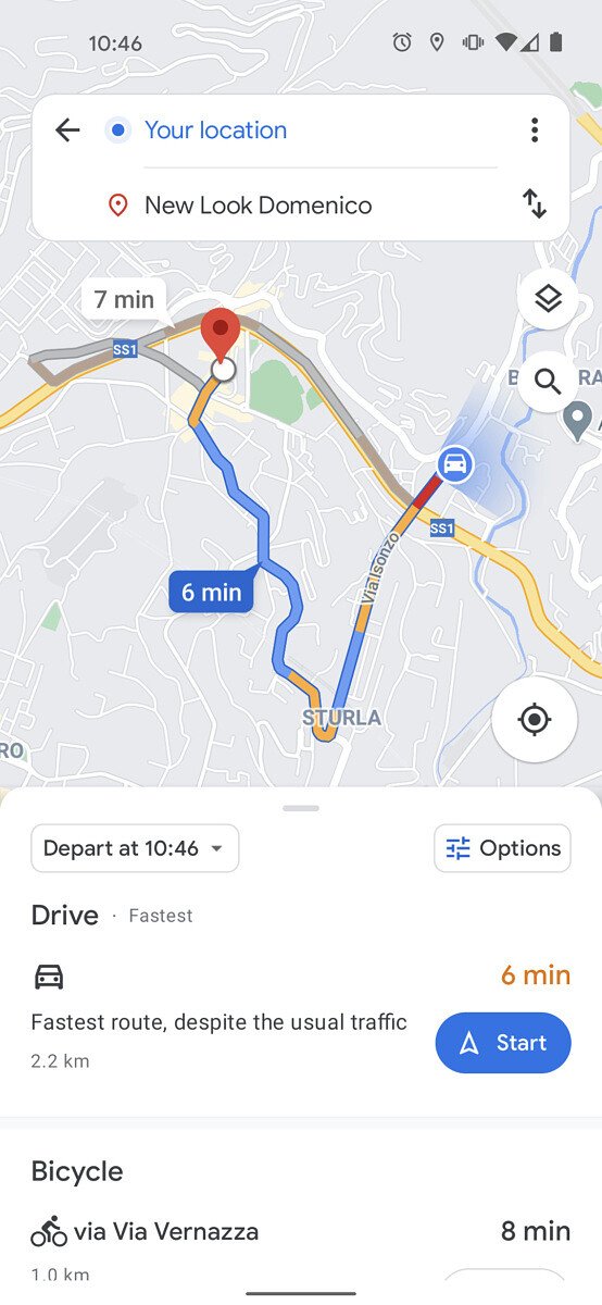
Spotted by XDA-Developers, the change appears in the route selection screen, where users are prompted to choose from a number of transportation modes. Instead of a boxed section at the top with a tabbed row of transportation modes, the destination input is now floating above the map, and the selection of transportation modes has been moved to a pull-out list at the bottom of the screen.
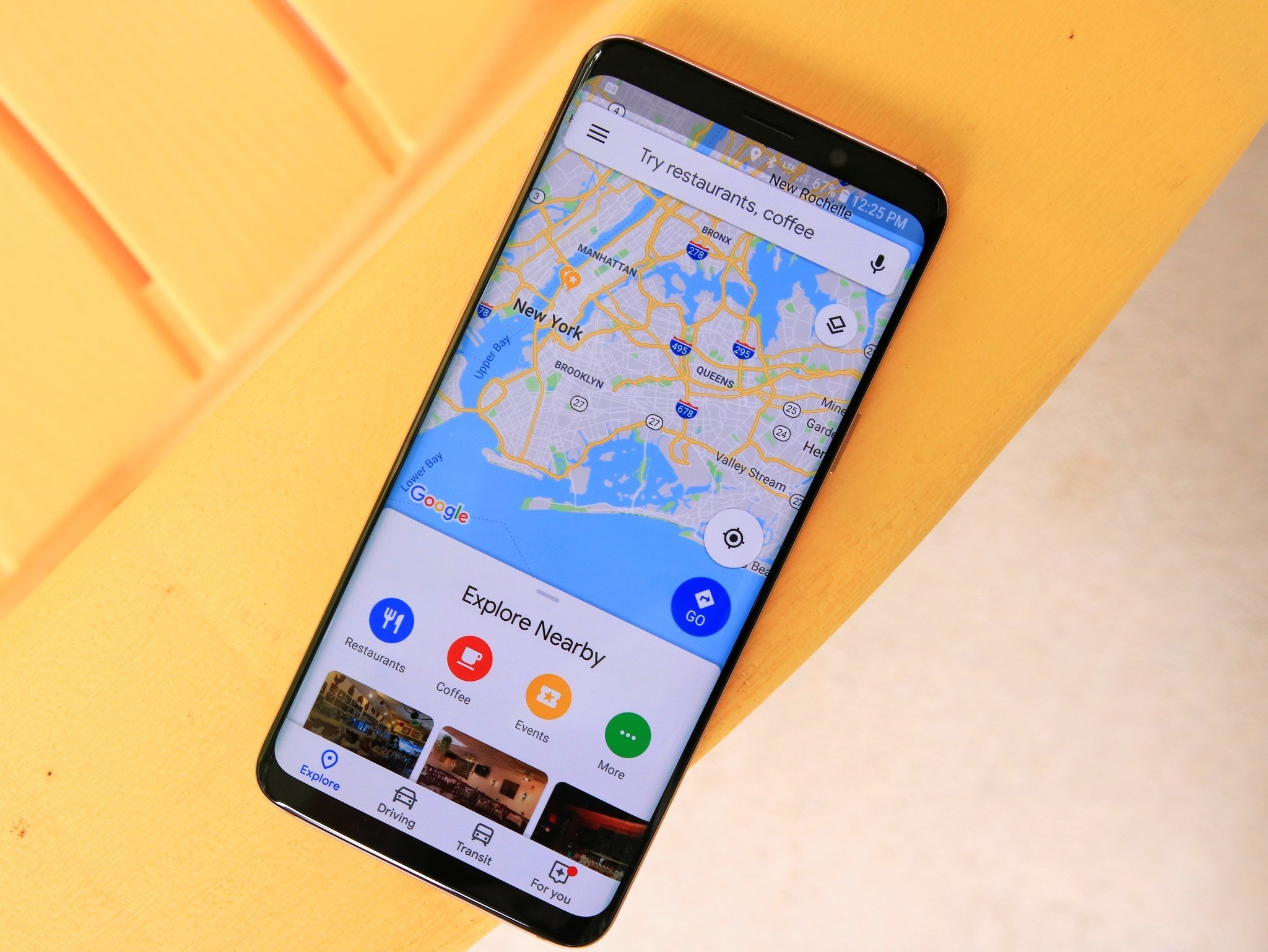
The new UI makes it easier to select a departing or arrival time, with easy access to additional route options. Whether or not the new look is cleaner is subjective, but the updated UI does make the app more uniform, more closely matching the floating search bar on the main Google Maps screen.
Unfortunately, the new UI seems to only be in testing, so it may take some time before we see a wider rollout. But given Google's cadence of bringing new features to its navigation app, it's only a matter of time before it reaches your Android phone.
Get More Pixel 5
Google Pixel 5


Post a Comment