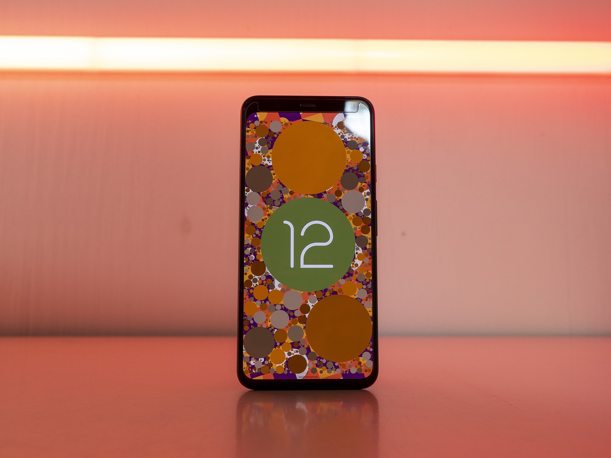
Android 12 is more than just a pretty upgrade.
When you think about Android 12, what's the first thing that comes to mind? For many people, it's probably the bold new styling that Google is pushing — known as Material You — but Android 12 is about so much more than just a pretty overhaul. Google has enhanced privacy, added convenient new features, and incorporated feedback from users in so many ways.
When your current phone gets the Android 12 update, or you pick up one of the best Android phones with Android 12 pre-installed, these are the Android 12 tips and tricks you need to know!
Change your phone up like the seasons
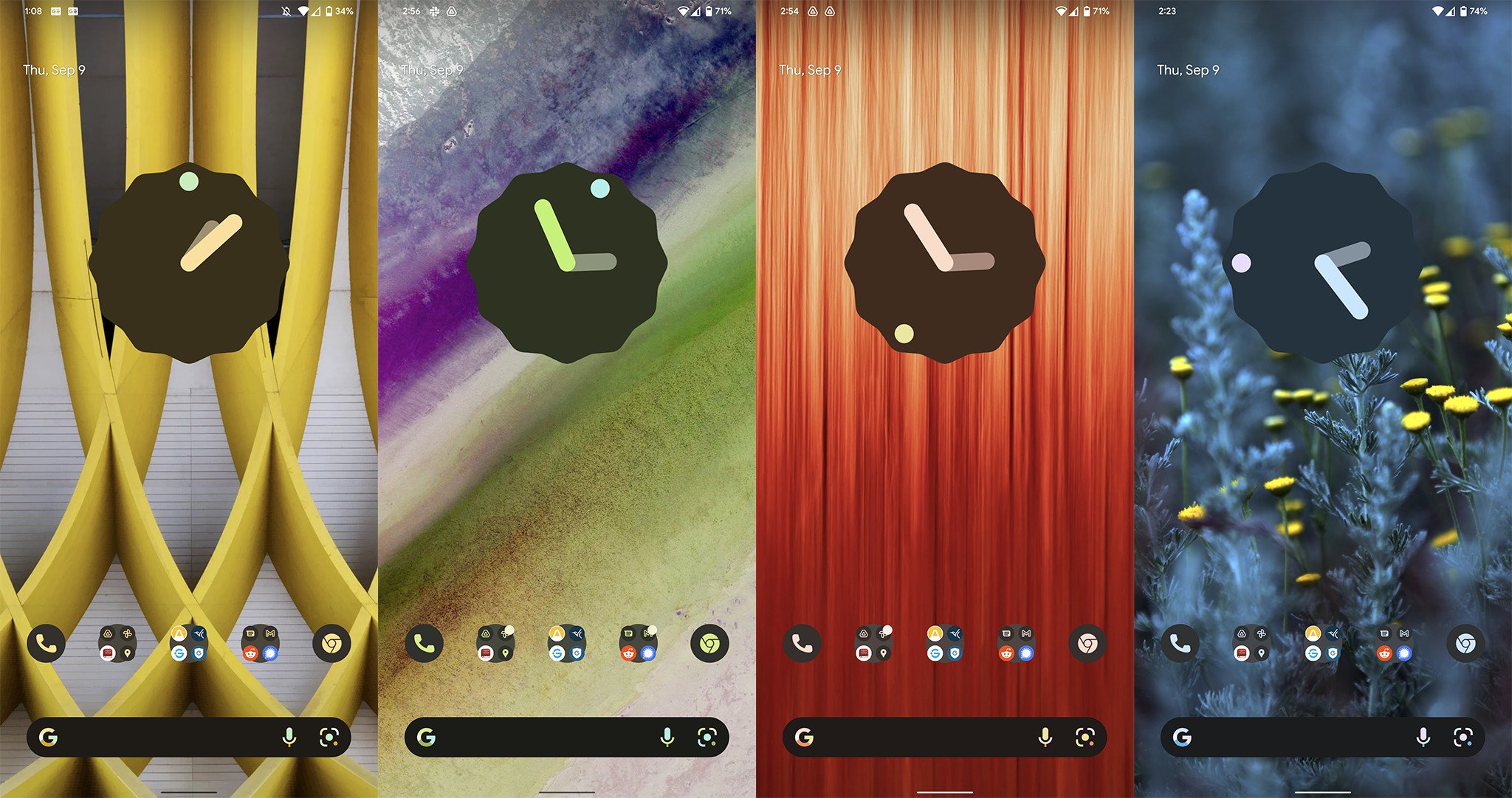
While it's not the only thing that's new in Android 12, there's no doubt that the new theme engine is the headline feature of this massive update. Android 12's potent theme engine looks to be best experienced on a Google Pixel phone, but many phones powered by Android 12 should have similar features. To get started, all you'll need to do is change your wallpaper.
You can get to the wallpaper & style app by long-pressing on any blank space on your home screen and selecting wallpaper & style. Google's software will automatically extract up to four different theme options based on the wallpaper chosen, which you can select below the Change wallpaper option. If you don't like one of the automated selections, you can choose from four colors under the basic colors section in the same app.
Colors are different depending on whether you've chosen light or dark mode for the phone, so experiment with those settings to find your favorite combination. You can even choose to apply the chosen theme to supported apps automatically, though not all of your favorite apps have likely updated to the new theme engine just yet. If inconsistency bothers you, leave this setting off.
New widgets make new friends
It's been some time since Android widgets have seen some love. But thanks to Apple's newfound fondness for widgets on its normally bland home screen, Google has seen fit to show them who did it first by giving its neglected widgets some attention.
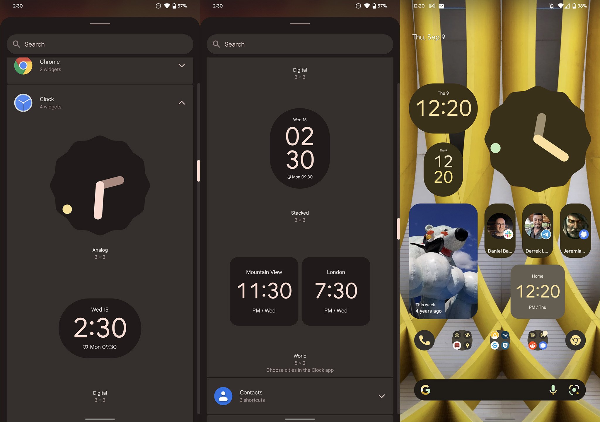
With Android 12, some of your favorite system widgets have seen significant overhauls or brand new additions. The clock widget is the most notable addition to the crew, with four brand new styles to choose from.
On top of that, a new conversations widget makes it easier to keep track of your favorite conversations without worrying about the app they've taken place in. Maybe your best friend prefers to use WhatsApp, while your other circle uses Discord. No matter what app your favorite conversations take place in, adding a dedicated conversations widget for each of these chats makes finding them a single tap away.
Searching just got easier
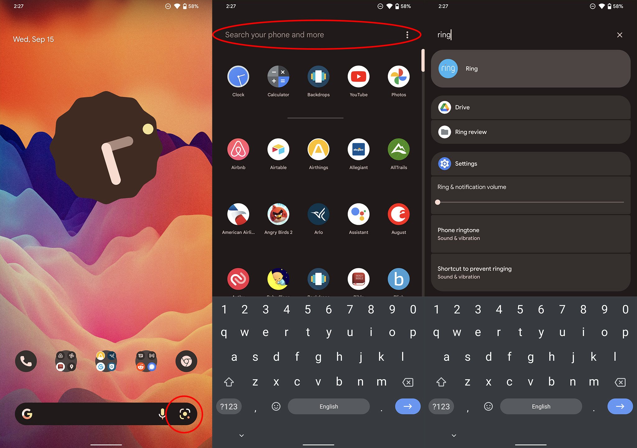
At the bottom of your home screen, you might notice a new icon next to that voice search microphone. That camera shutter-looking icon is a quick shortcut to Google Lens's visual search, which lets you take a picture of anything you can think of and get visual search results right from Google.
Visually searching for something can be superior to typing it in for several reasons. Maybe it's searching for a flower you came across on your daily neighborhood walk or just scanning the QR code at the restaurant you just sat down at. No matter what you need to look for, Google Lens is the easiest way to find it.
Google's new device search can be found by typing anything into the search box in the app drawer. Swipe the drawer up, type in a word or name, and it will display everything from apps to conversations and emails. It'll even display your downloaded files. It's a new way of organizing information that is now a one-stop shop for anything you might need on your phone.
To make things even easier, you can toggle the keyboard to appear as soon as you open the app drawer. While this might be a bit jarring at first, having everything just a few key taps away quickly become the quickest way to access anything that can't be pinned to the home screen. To do that, click the overflow menu on the right side of the device search bar — remember, that's the one in the app drawer — and select always show keyboard.
Prioritize your quick toggles
In Android 12, Google reduced the number of quick toggles shown in the notification shade. Instead of five small icons, you'll now find four larger rounded-off rectangular buttons. Similarly, when you pull down the notification shade all the way, only eight toggles are now available, while Android 11 showed a total of ten toggles. As a result, you'll need to make sure you prioritize these toggles to make the best of the situation.
As before, customizing your quick toggles is as easy as pulling down the notification shade all the way and clicking the pencil icon below the last row of quick toggles. Pay close attention to what's in this menu, too, as Google has added several new toggles that are well worth taking a look at.
Can you see (or hear) me now?
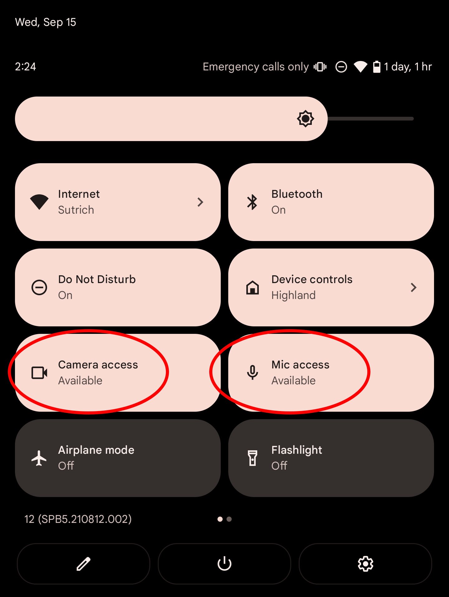
Located in that quick toggle panel is a new set of buttons that allow you to universally revoke camera and mic access for all apps on the phone. These buttons can be used as a temporary way to block the use of all cameras or microphones on your device and could be a godsend for the virtual meetings we're all regularly a part of nowadays.
To find these new buttons, pull down your notification shade all the way and click the edit button — it looks like a pencil — then drag the camera access and mic access buttons up into the active part of the quick toggles panel. Now, any time you want to block camera or mic access, pull down the notification shade and click either of the necessary buttons.
Get to know the new Internet panel
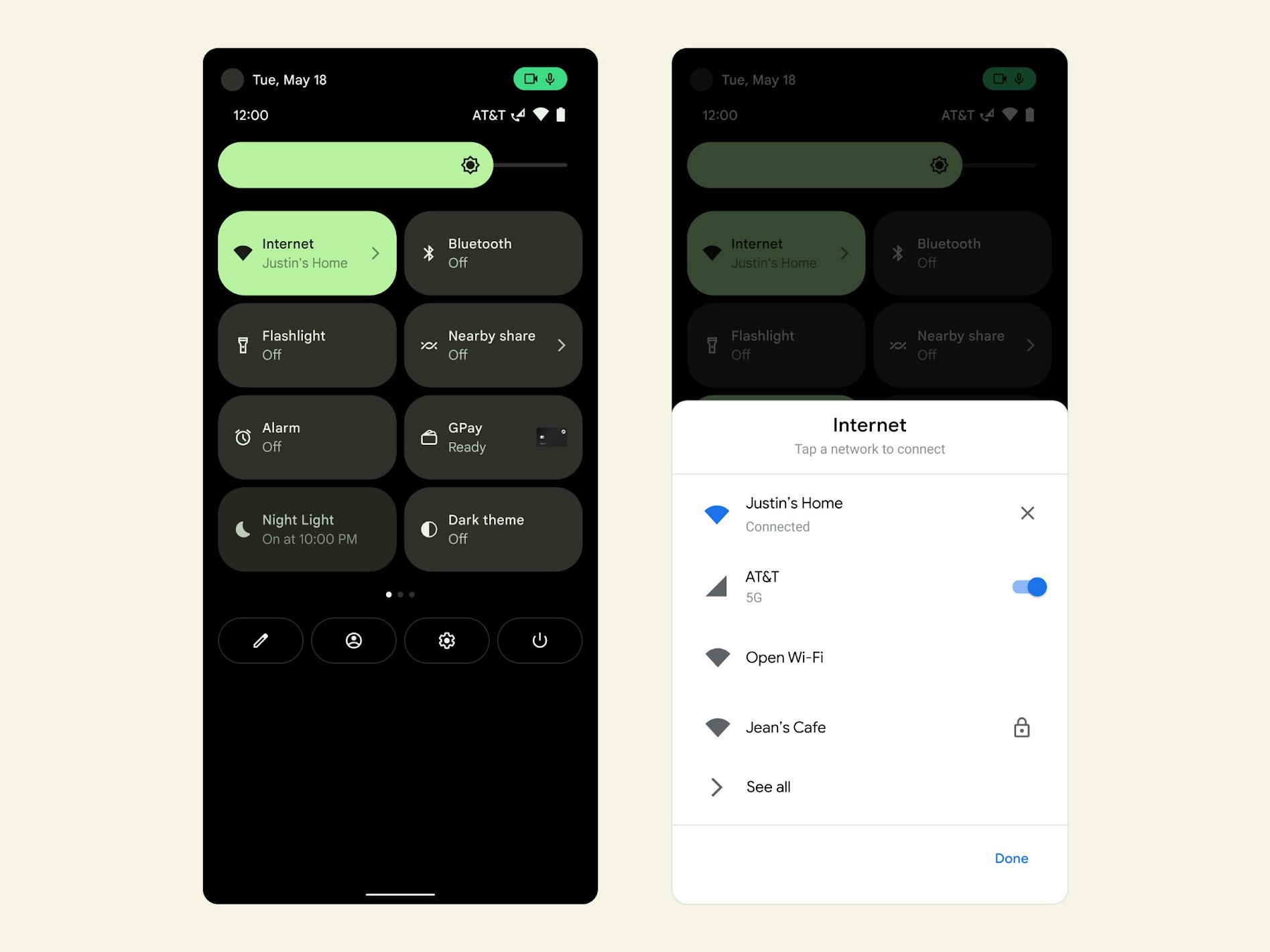
Before we leave the quick toggles area, you might want to click on the one labeled Internet. Previously, this quick toggle only handled Wi-Fi connections and, even then, the past few versions of Android removed the quick switch feature. Quick switching is back, and Google has combined Wi-Fi and mobile data into one handy panel known appropriately as the Internet panel.
Clicking on this new quick tile will bring up a half-sized dialog box from the bottom of the phone that lets you quickly switch between Wi-Fi networks and toggle Wi-Fi and mobile data on or off.
Evolving device controls
Google previously added a device control panel to the power menu in Android 11. It was a feature loved by many, as it made smart home control as quick as pressing and holding the power button and tapping on a quick toggle. Google is aligning its designs with Samsung in Android 12, using the power button to call up Google Assistant instead. You can disable that feature easily by opening up the Settings app, scrolling down to System, selecting gestures, then toggling the press and hold power button option.
If you're looking for device controls, you'll find them in one of two places: in the notification shade as a quick toggle — which I would recommend moving into the top four if you regularly use it — or on the bottom-left corner of the lock screen. Either way you access it, the device controls panel looks identical to what we saw in Android 11. Accessing it is the change, and while it's caused quite a stir among beta testers, it's likely Google is keeping device controls in these locations for the time being.
Sharing with someone close
Google has experimented with local sharing capabilities for years. Previously, in Android 11, Nearby share was only useful if someone nearby was in your contacts list. But its latest updates to Nearby Share make it easier than ever to quickly share a link, photo, or something else with folks in your general physical vicinity. Nearby share is easily called up by using the quick tile when you pull down the notification shade.
Now, in Android 12, a new half-sized dialog box appears on the bottom portion of your screen when you select nearby share and allows you to enable sharing for everyone nearby. Google's design allows you to temporarily select the everyone sharing mode, thereby reducing the risk of what often happens with Apple's AirDrop functionality. This new design also means it's a one-tap change to select this option, while you would previously have had to go into sharing settings to change this value.
A quick tap on the back
With the Pixel 5, we saw Google shift from using a squeeze to launch Assistant to using other methods, such as the power button. Initially hidden was the ability for the Pixel 5 to launch shortcuts or apps with a quick tap on the back of the phone, essentially working as an extra quick launch button without a physical button being present.
That makes it easy to play or pause music, launch your favorite digital assistant, see your recent apps, or open any custom app you'd like.
In Android 12, Google is expanding the number of functions you can assign to the back tap; but only a select few devices support this new functionality. If you've got a device that supports back tap, like the Pixel 5, here's how to set it up.
Rotate only when it makes sense
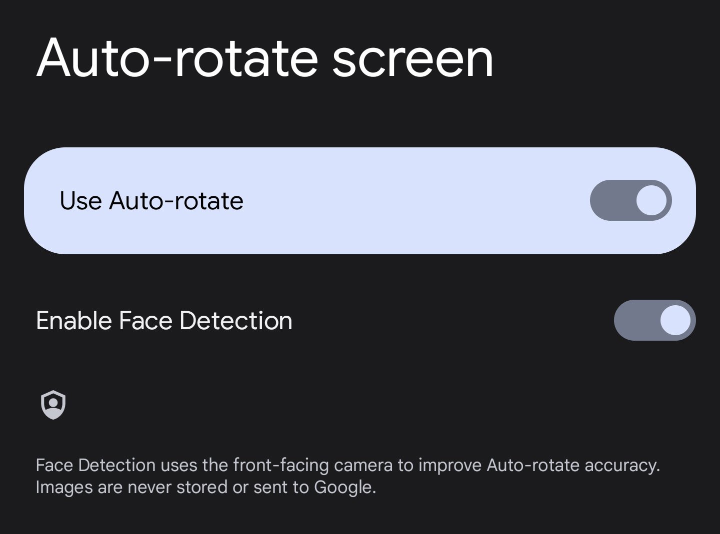
Have you ever been lying in bed watching something on your phone when it suddenly rotates on its own? This is most common when laying on your side and trying to read portrait content while holding your phone in landscape orientation. Sure, you could turn auto-rotate off, but Google has learned a few tricks over the years and can now use machine learning to determine the orientation of your face relative to the phone.
In a nutshell, that means the phone won't rotate so long as it sees your face is oriented in the same direction as the screen. To enable this new face detection mode, head on over to display settings in the phone's system settings app, click on the auto-rotate screen, and enable the face detection feature.
Google keeps any camera data obtained for the use of this feature on your phone, locked away behind the Android Privacy Core and inaccessible to any other apps. It's also not stored after being used to determine whether the phone should actually rotate or not, so there's no need to worry about that data sitting around somewhere. If you don't like your phone looking at you, here's how to disable Android 12's head-based auto-rotation.
Take control of your privacy
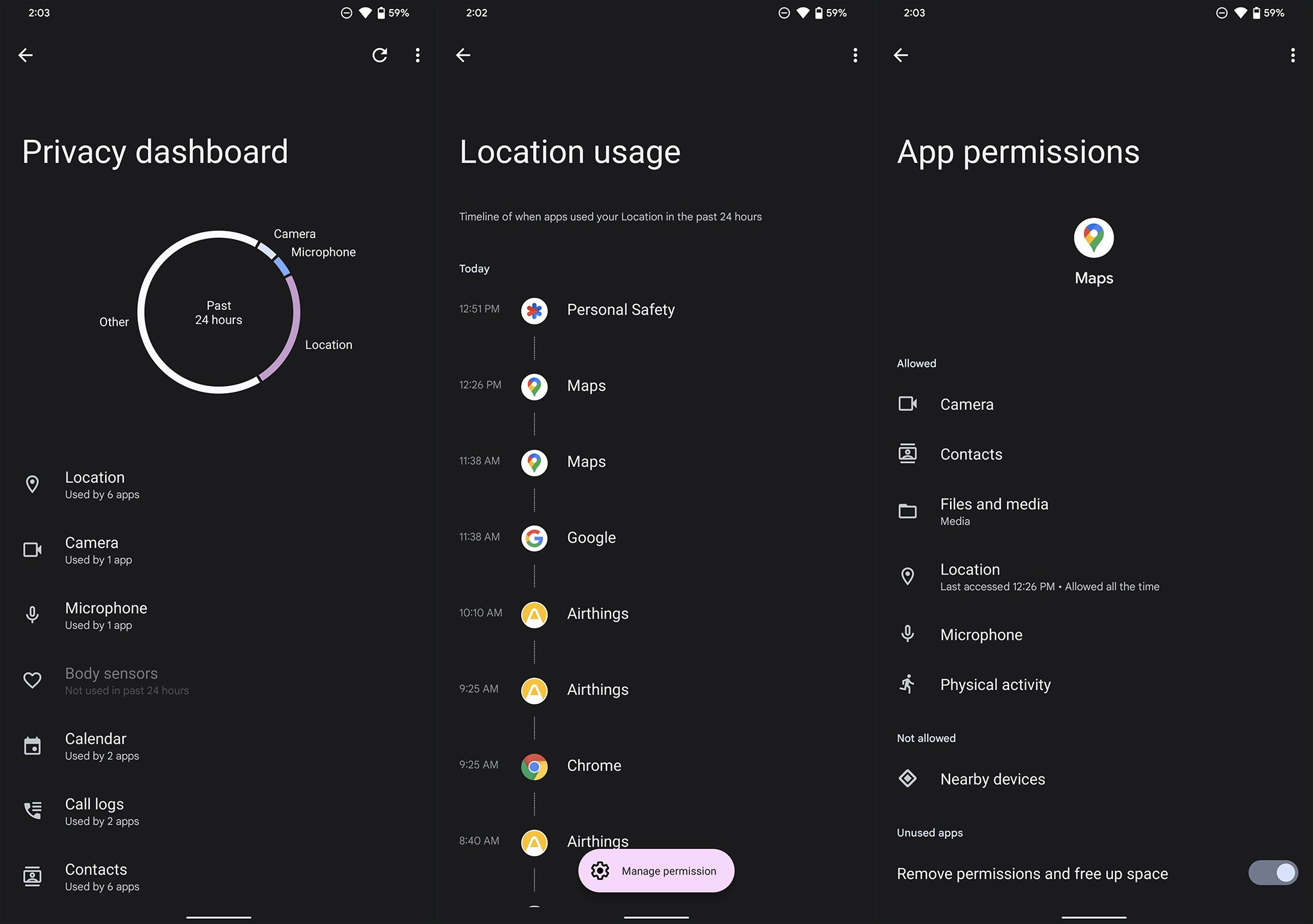
With Android 12, Google is introducing the concept of a Privacy Dashboard. Privacy Dashboard makes it easy to see all the different permissions apps request throughout the day, including super detailed statistics for the three categories that could see the most heinous abuse: location, camera, and microphone.
Selecting any of these three permissions brings up a timeline view of every app that accesses that permission, along with a way to remove an app's ability to access that permission quickly. Right now, Android 12 only offers 24 hours' worth of detailed history by default. Some manufacturers, like Samsung, have extended that history out to one full week's worth of permission access data, giving you an even more detailed look at what apps are doing with your data.
It's good to stop by the privacy dashboard every so often, especially if you notice any new camera or microphone indicators appearing when you don't expect them to. Those new indicators appear in the form of bright green icons on the top-right corner of the screen any time an app accesses your camera or microphone. That's a massive step forward for users' privacy, as it means you'll always know when an app accesses your camera or microphone.
Previously, you just had to trust that an app wouldn't abuse these permissions. To find Privacy Dashboard, open your system settings and look for the privacy section.
Capture a long screenshot
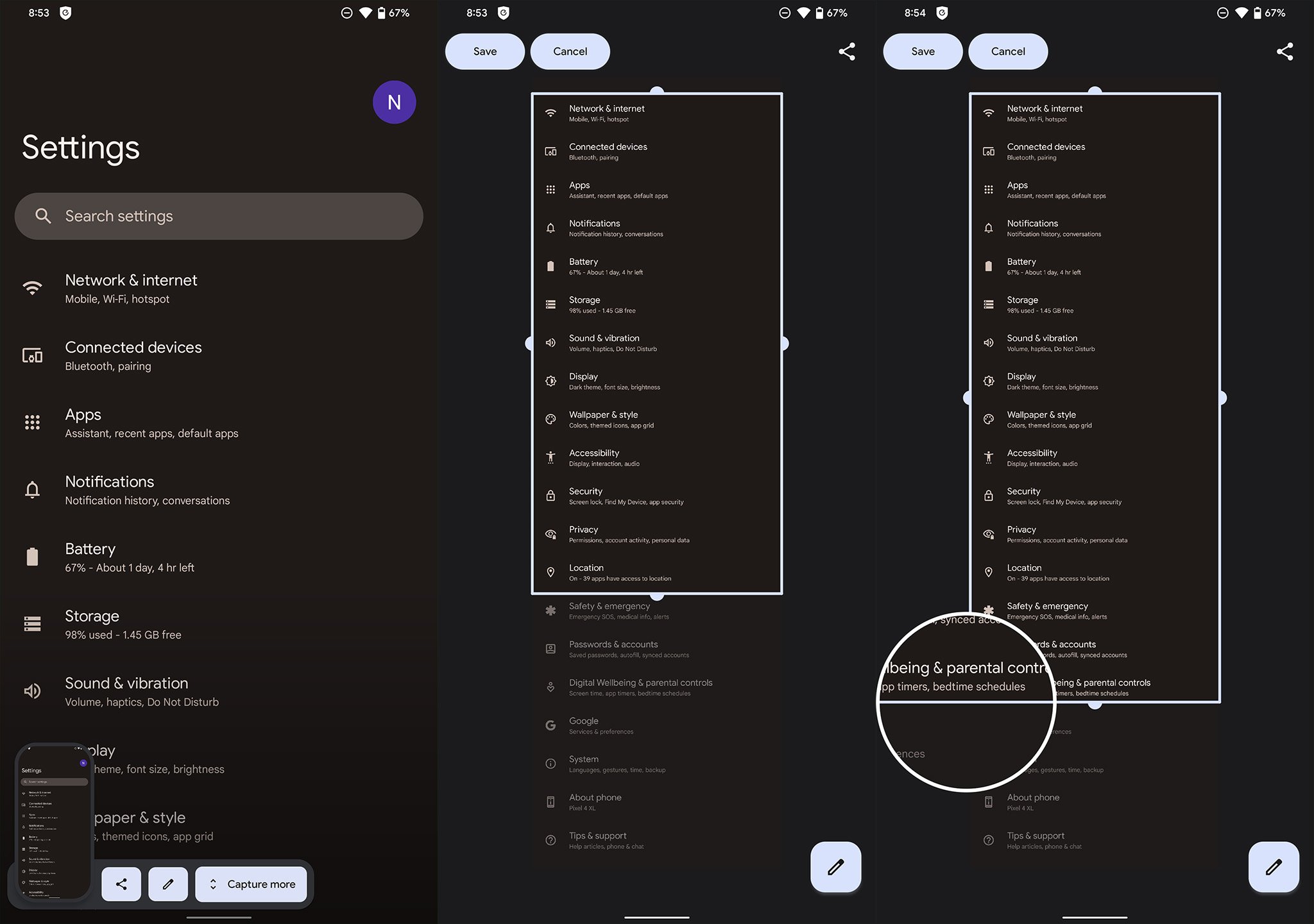
Scrolling screenshots have been a feature of many Android phones for years, but Google is finally officially adopting it in Android 12. But this isn't just some carbon copy of a feature that many already know; it's a sensible redesign that makes taking long screenshots easier than ever.
When you take a screenshot — typically invoked by pressing the volume down and power keys simultaneously — a new capture more button allows you to take a screenshot of more than just what you can immediately see on screen. Google's refined version of this now-common feature includes a brilliant magnifying glass-like zoom feature when dragging the bounding box down, allowing you to more precisely align the edge for what you were trying to capture.
Better ways to multitask
Back on Android 9 Pie, Google introduced a new type of multitasking screen, also known as Overview, that prioritized capturing text from another running app over fast app switching. While this has been a point of contention for some people, Google has doubled down on its efforts to make the Overview screen a place you go to capture information quickly, rather than just switching between apps.
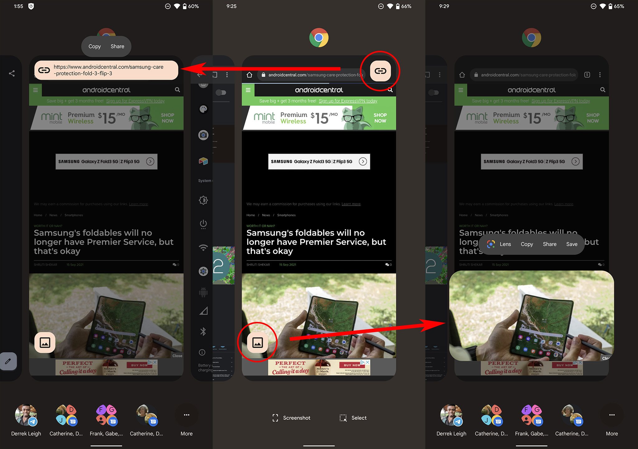
The latest upgrade comes in the form of quick link and image sharing, which can be seen by two new icons on each Overview tile. In the screenshot above, you'll notice a chain link icon next to the website URL, which can be clicked to quickly copy the URL to the clipboard for fast sharing, effectively removing a few taps from this common task.
The second is the new image icon, a shortcut for quickly extracting a picture from a supported app. From there, you perform a visual image search via Google Lens, copy, save, or share it with the system dialog, or quickly share it to one of four common contacts along the row at the bottom.
Battery drain 101
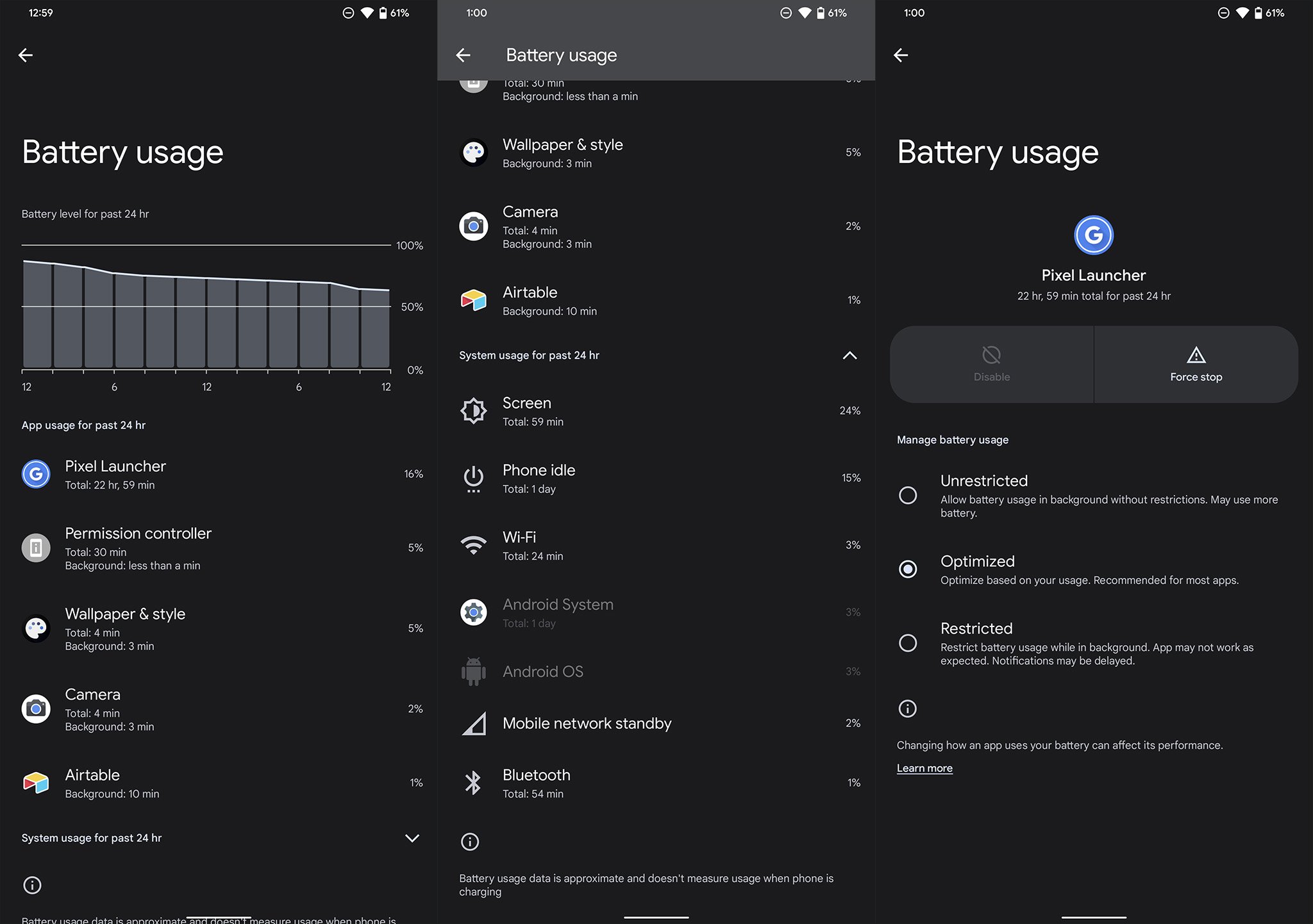
It's been some time since Android battery statistics were useful; in fact, the most recent versions of Android had simplified battery statistics we found nigh useless for actionable information. Android 12 fixes this glaring issue with a significantly more detailed look at what has been draining your phone's battery throughout the day. Its battery usage pane showcases an easy-to-read graph up top and detailed app statistics below.
Now it's easy to see just how much of a percentage of the battery your apps might have drained, but total usage time and background time without having to click into another section. Clicking on any app in this list will bring you to the battery optimization page for each, allowing you to specify more or less strict usage restrictions with a single tap. It's another great way Google is simplifying things without taking away needed functionality or information.
Get your favorite apps more quickly
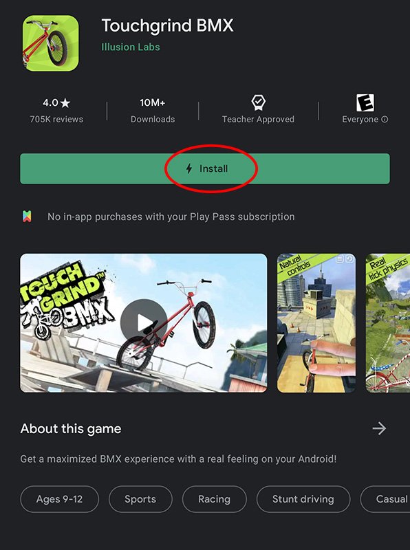
While perusing the Google Play Store on an Android 12-powered phone, you might have noticed a small lightning bolt icon inside of the download button for some apps. Typically reserved for games, the new play as you download feature does exactly what it sounds like. A small percentage of a larger game will be downloaded first, allowing you to begin to play in a short amount of time while the rest of the app downloads in the background.
This is particularly important for several big titles that often weigh in at multiple gigabytes in size and could take a significant amount of time to download. Any game that supports this feature will let you play after only a few seconds of download time, getting you into a new game quicker instead of having to wait around or doom scroll social media while waiting.
Android 12 to the rescue
Android 12 is a gorgeous new way to interact with your phone every day, adding a splash of color everywhere, new features, and everyday tasks and information that are easier to access and understand. Google has built plenty of new tricks under the hood, like the machine-learning-enabled face detection feature while rotating the phone, to color palette extraction from a single picture for the whole UI. It's beautiful, bold, and exactly what Android needs.


Post a Comment