The new Google Tasks logo is rolling out next week.
What you need to know
- Google has announced a new logo for Tasks.
- The new logo will be applied across the web and mobile where the app is available.
- It will begin rolling out to Workspace customers as well as G Suite users next week.
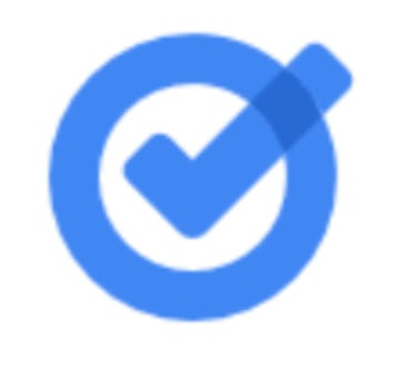
Google has unveiled a new logo for Tasks, giving the app a new look that's consistent with the other services under the Workspace umbrella.
The new logo design is getting rid of the yellow dot and white pill that vaguely formed a checkmark against a blue circular background. It will be replaced by a simplified blue checkmark that breaks the blue ring encompassing it.
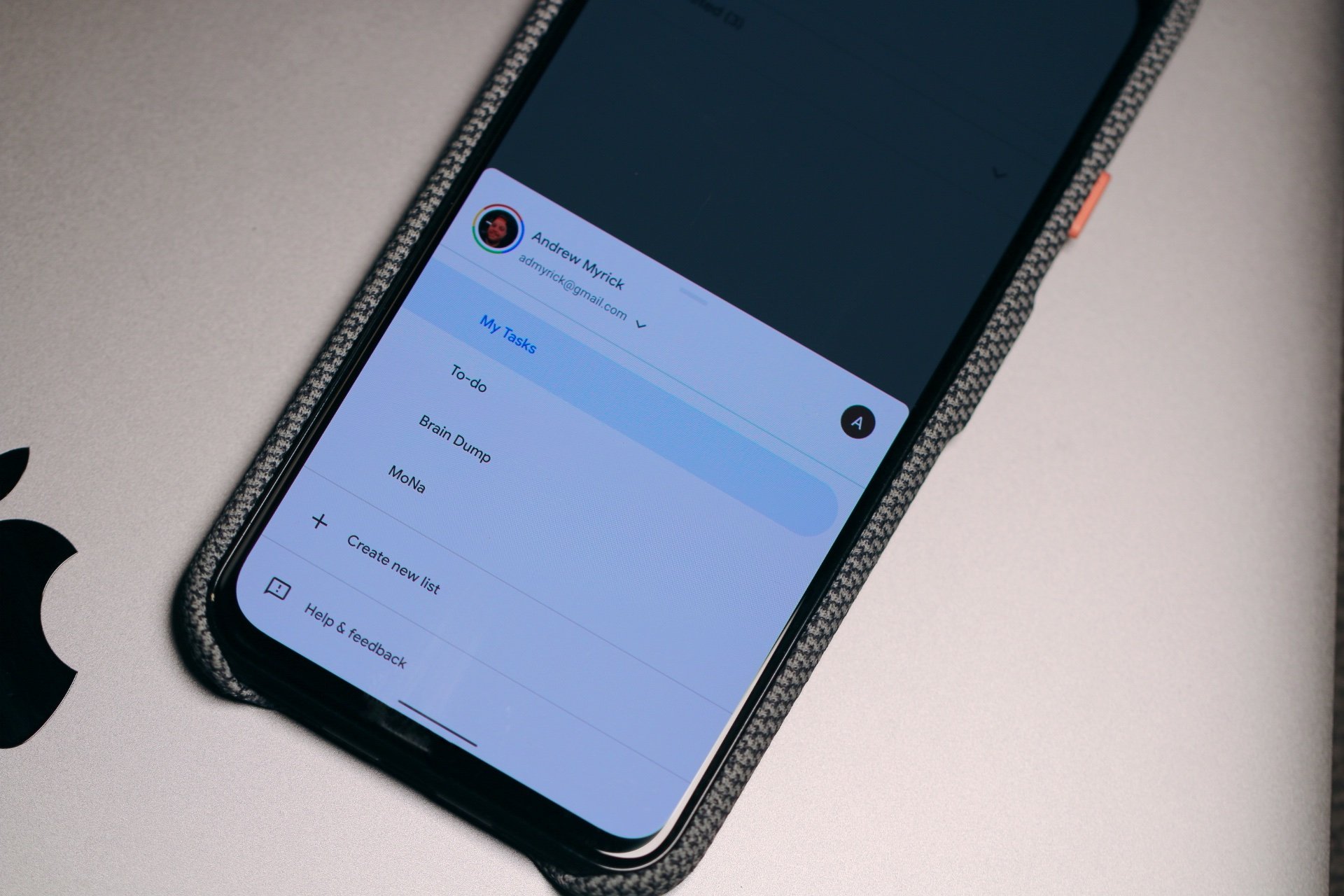
Google plans to implement the new Tasks logo in places across the web and mobile platforms where it is integrated. These include the add-on sidebar in Gmail, Google Calendar, and the mobile app for Android phones.
The latest change comes 10 months after Google updated the logos for several other Workspace services including Gmail, Drive, Calendar, Meet, Docs, Sheets, and Slides. Those productivity apps received new icons late last year when the search giant introduced Google Workspace, a rebranded G Suite service.
With Tasks getting the same treatment in the next few days, Google looks to ramp up its commitment to an often underrated productivity app. Last month, an unreleased feature of the app that would let you mark an important chore with a star button was discovered in an APK teardown.
According to Google, the new Tasks logo will begin rolling out on September 23 and should be available to everyone within two weeks. All Workspace customers, as well as G Suite Basic and Business customers, will be able to use it.


Post a Comment