
Inspect Element
Did you know what is inspect element is ?
 What is inspect element?
There's a powerful tool hiding in your browser: Inspect Element. Right-click on any webpage, click Inspect, and you'll see the innards of that site: its source code, the images and CSS that form its design, the fonts and icons it uses, and the Javascript code that powers animations and more.
How Do you get inspect element?
To access the DevTools, on any web page or app in Google Chrome you can use one of these options:
- Open the Chrome menu at the top-right of your browser window, then select Tools > Developer Tools.
- Right-click on any page element and select Inspect Element.
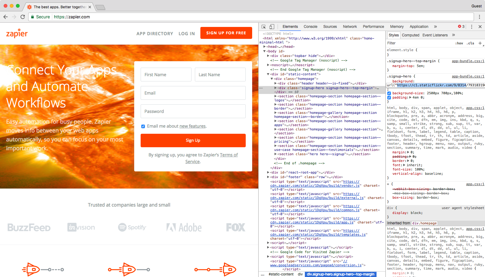
Change Images
You can easily change images on a web page with Inspect Element, too. Let's swap the Superhero background on the Zapier site with this dramatic photo of a solar flare from NASA.
First, copy and paste this link to the image:
https://c1.staticflickr.com/9/8314/7931831962_7652860bae_b.jpg
Now, open Inspect Element on the background of the Zapier homepage, and make sure you've selected the
signup-hero line in the code. Double-click the background URL link in the "Styles" pane, and paste the link you copied above.
Press "enter" and see the difference immediately.
Editing text is handy, swapping out images is fun, and changing colors and styles just might help you quickly mockup the changes you want made to your site. But how will that new tagline and button design look on mobile?
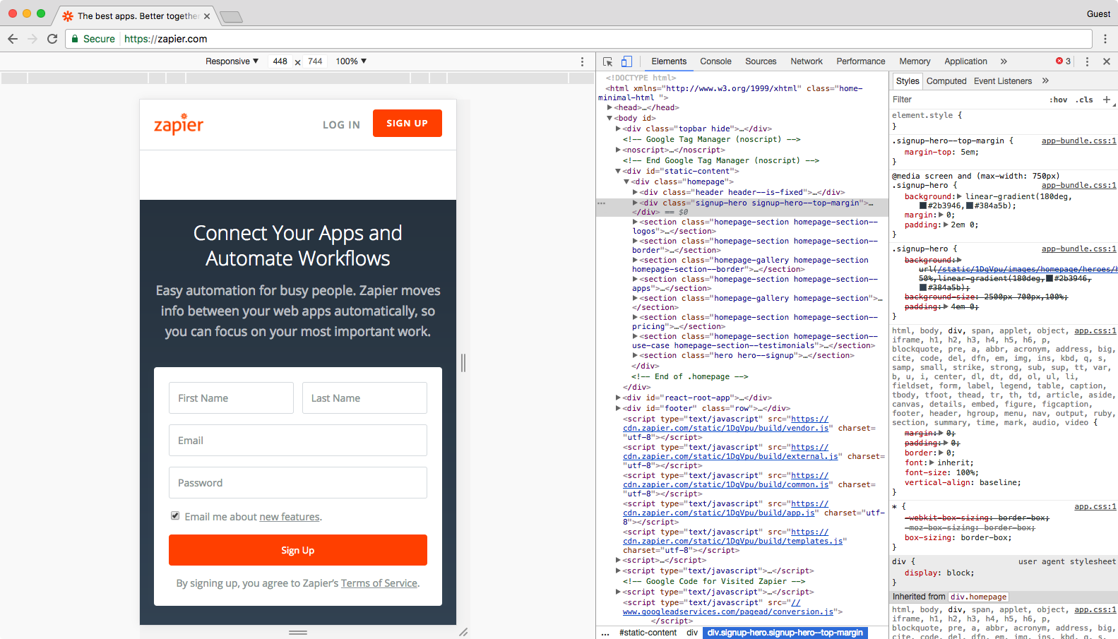
Test a Site on Any Device With Emulation
Everything has to be responsive today. Websites are no longer only viewed on computers—they're more likely than ever to be viewed on a phone, tablet, TV, or just about any other type of screen. That should always be kept in mind when creating new content and designs.
Emulation is a great tool to approximate how websites will look to users across various devices, browsers, and even locations. Though this does not replace actually testing on a variety of devices and browsers, it's a great start.
In the Developer Tools pane, you'll notice a little phone icon in the top-left corner. Click it. This should change the page into a tiny, phone-styled page with a menu at the top to change the size.
Resize the small browser to see how things look if you were browsing on a tablet, phone, or even smaller screen. Or, click the menu at the top to select default device sizes like
iPad Pro or iPhone 6 Plus—go ahead and select the latter.
The web page screen should shrink down to an iPhone 6 Plus' size, and you can zoom in a bit by clicking the + icon next to the number at the top right of the grid—that's how the site would look if someone zoomed in on mobile.
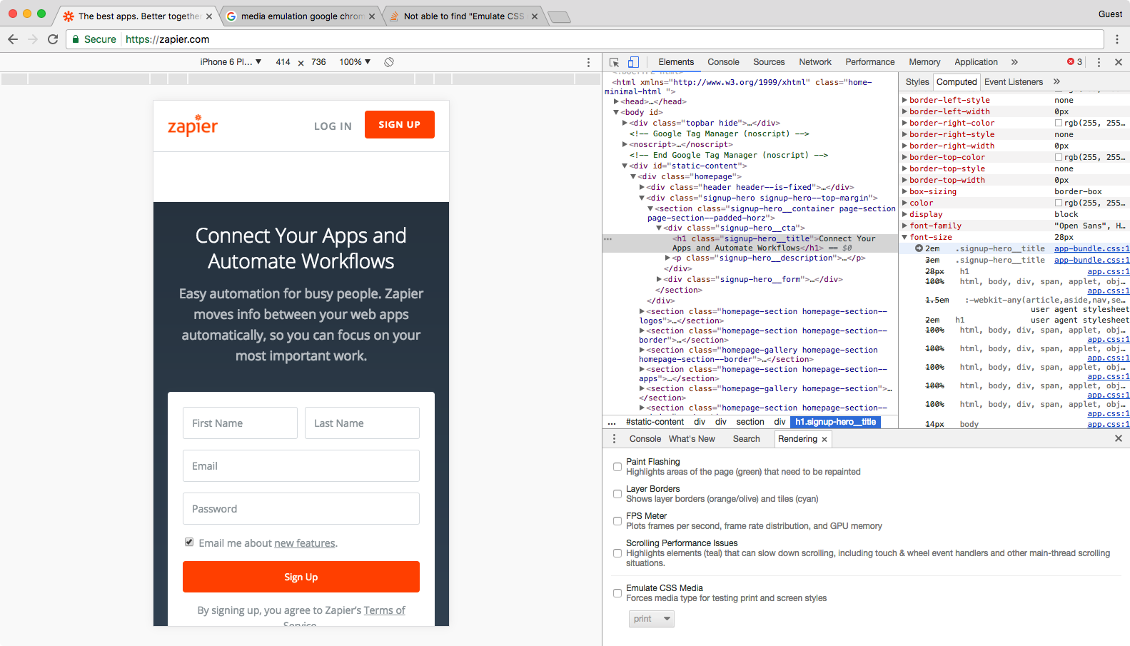
Go ahead enlarge the view by dragging the right edge of the web page emulation right. See what happens? We're no longer in the iPhone 6 Plus view. Dragging the screen along the grid allows you to see how the web page will change as the screen size changes, but your view will no longer reflect the device model that you chose previously.
Let's go back to the iPhone 6 Plus view by selecting this in the model drop-down list again. Next to the drop-down list is the word "Portrait." As you may have guessed, this allows you to toggle between the landscape and horizontal view.
Now, we can see how this post would look if you were reading it on an iPhone 6 Plus. Feel free to play around with the other devices to see how this web page and the screen resolution changes. All of the other developer tools that we have gone over so far will also react to the device view. For example, select the text of Zapier's tagline again.
In the iPhone 6 Plus view, we can see that this text is 2em, while in the default view on a computer, it's 3em.
The "em" is a font-size unit that allows you to automatically change the size of text relative to the surrounding text. For example, let's say we have a user with large custom font settings on their browser. If you set your paragraph font-size to 14px, your font will always be 14px to that user no matter what. However, if you set your paragraph font-size to 1em, your user's browser will use this unit to scale your text to your user's large settings. Phones and tablets do this to zoom text nicely.
Now let's switch to the Apple iPad view and select the "testing across devices" header above. This time, the font-size is 3em. The font-size changed based on the device view, back to the default size it'd use on a computer, thanks to the tablet's larger screen.
Post a Comment